I am guilty of frequent app hopping. This year, though, that is going to change. I’m fully determined to pause the constant chase for an ever better tool. While I enjoy to check out new apps, move data back and forth — and back again — I’ve come to the conclusion that I need a break and commit to a set of tools for a longer period.
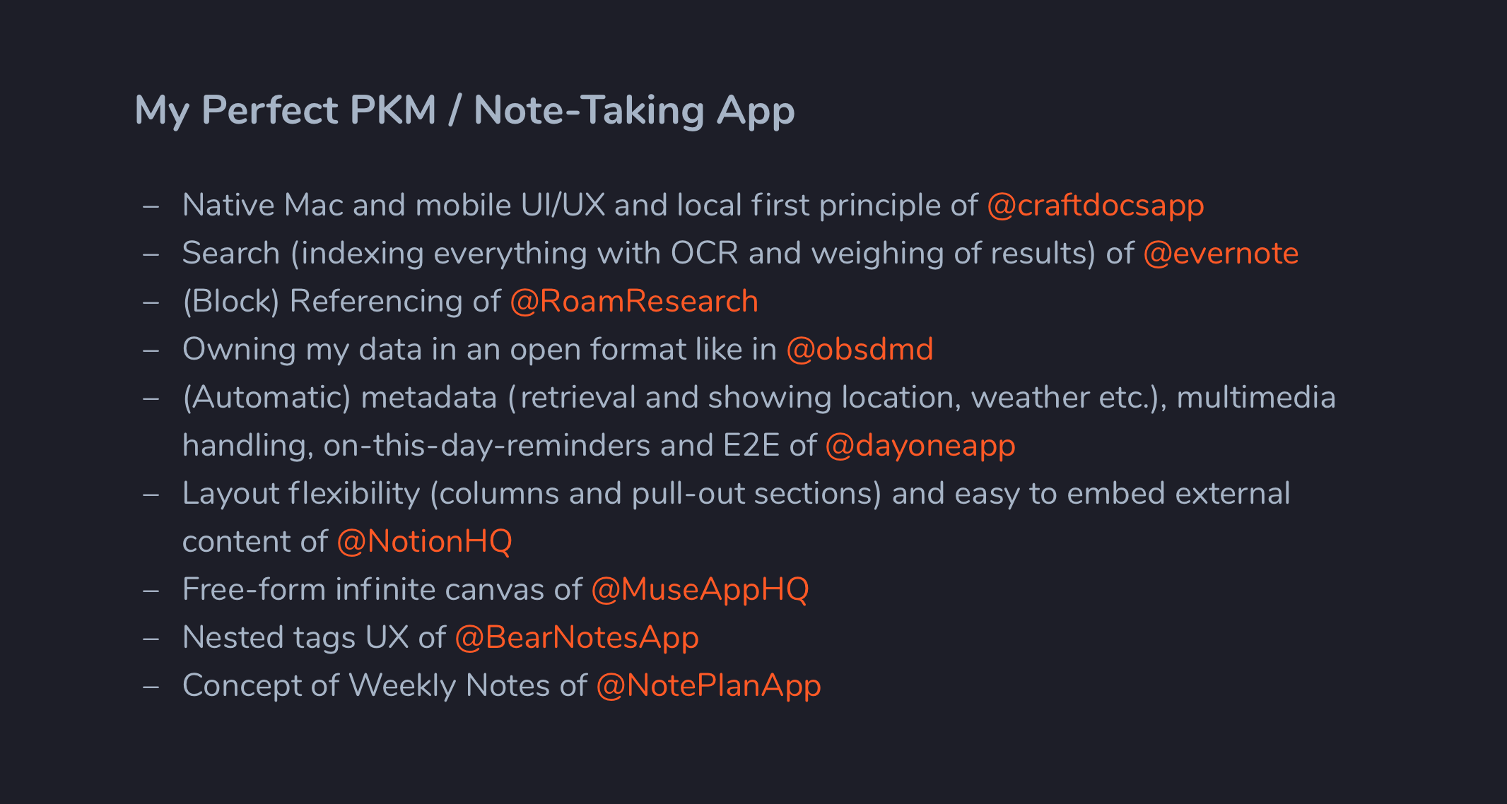
Recently, TfTHacker asked on Twitter, what one’s perfect note-taking app would look like. I came up with a growing list of features that I like a lot across various tools I’ve been using throughout the years.

This list was surprisingly helpful to make conscious decisions about the tradeoffs I’m willing to make when settling for a set of tools.
Craft Docs: Central knowledge hub

I’ve been using Craft before for a couple of times, so I knew quite a bit about both its advantages and shortcomings.
Here are the reasons it came out winning against Evernote, Obsidian, Roam, Logseq, Tana, Mem and many more:
- Unmatched user experience across Mac, iOS and iPhone. It’s fast and fun to use. Nothing beats the tool you enjoy using.
- Offline first. Sure, I’m online most of the time. But not being able to access my notes when I’m not is just not acceptable. Also, it’s so much faster than, say, waiting for Notion.
- Daily notes. It’s freeing to have a default space to just dump everything that has not yet a dedicated space — or doesn’t need one at all.
- Easy internal linking, including backlinks and dates. While this could be improved quite a bit, it is simply enough for me at this point. Block-level Transclusion would be nice, but it’s not a necessity for me. Also, it is really nice to be able to link to certain sub-pages in a document, and have backlinks show accordingly on the sub-page instead of the parent.
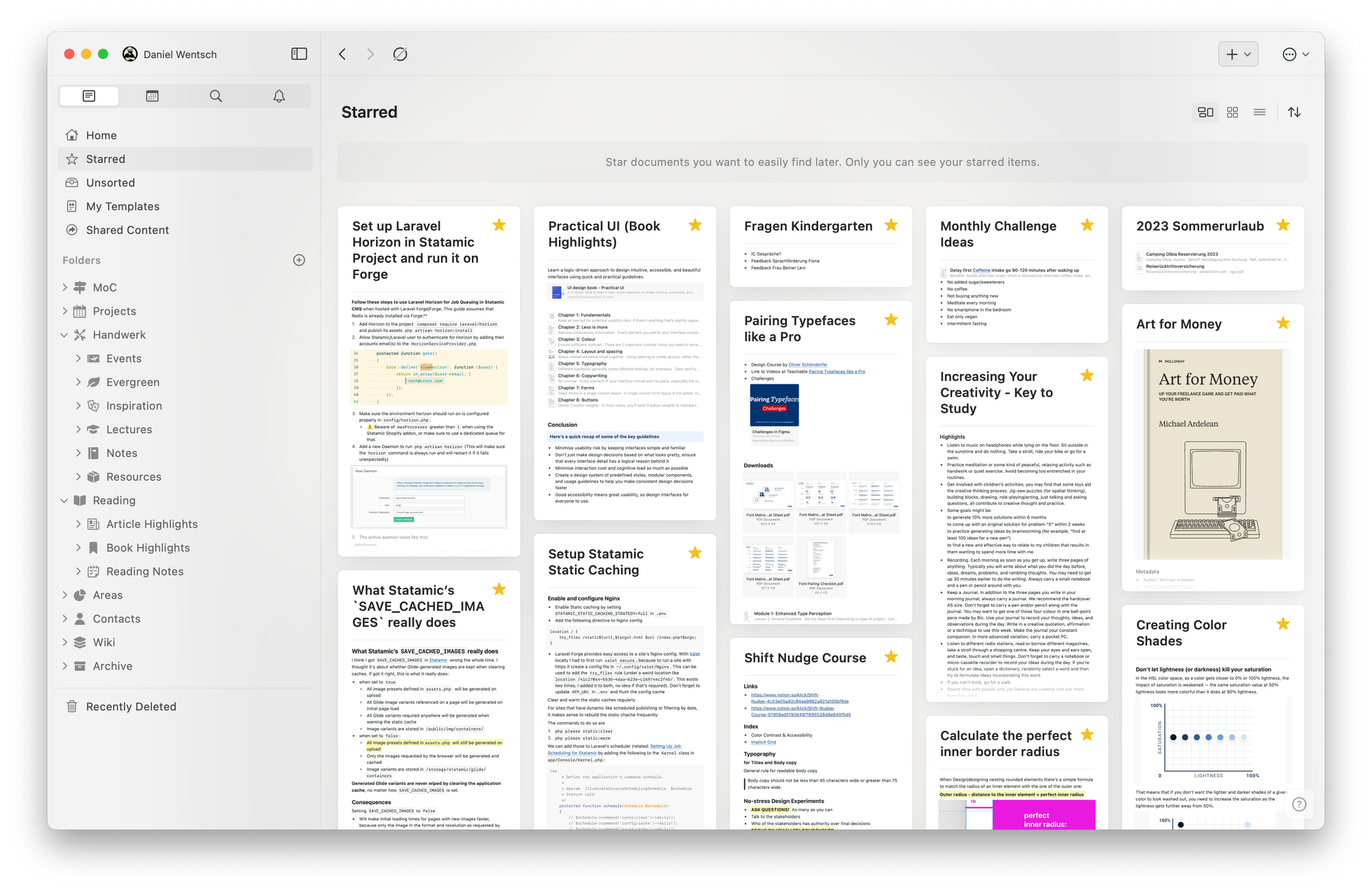
- Quick open command. While this feature is present in most of today’s note-takers, it would be a serious downside if it were missing. Bonus points for Craft’s beautiful implementation that shows a preview of documents with the search term highlighted. And some more bonus points for being able to navigate to folders, too.
- Not having to care about attachment paths and file names. As much as I’d like to have the data ownership that plain text apps like Obsidian offer, I can’t come around to hating the fact that images are either a total mess or need a lot of care to but them in the right place with the right name.
- Being able to import and export in textbundle format. Dealing with plain markdown files that contain numerous images is such a mess, and knowing I can take all my notes with all their attached files and migrate them painlessly to any other app that supports textbundle eases the pain of working with a proprietary system.
- Being able to quickly share a note under a publicly accessible URL. Because it’s an unnecessary step having to export a note to some other place just to be able to show it to somebody. Also, as the original note might diverge over time, it’s nice to be sure the recipient can always see the latest state.
- Visual Overview. I just love browsing a folder in the waterfall cards layout, rediscovering things I collected or wrote in the past.
- Craft assistant is surprisingly useful. I wasn’t aboard the AI assisted writing hype train, but once GPT-3 was at my fingertips anyway, I started to check it out and found it to be quite helpful. For example, I could quickly improve the copy for a client’s website by generating section headings or short teaser copy, all without having to dive too deep into the subject. The client was happy with the results.
Downsides of Craft I’m accepting
- The lack of an automatic integration with Readwise turned out as not much of a problem as I had thought. The act of pulling in highlights one after another (using the CraftX Readwise extension) is something I actually started to enjoy. It nudges me to review and progressively summarize my highlight more often — and to ruthlessly delete things of low quality.
- Search is seriously flawed. Like many block-based apps, Craft’s search finds results only when search terms are found in a single block. So if I have a document that mentions tomatoes in one block and pepper in another, a search for
tomato pepper won’t yield said document as a result. Moreover, attachments like PDFs are not indexed at all, let alone OCR on images. This is the one thing Evernote still does really better than most of its competition.
- I’m not too happy with the (perceived) direction of the company. Craft seems to steer ever more towards businessy-team-collaboration-google-docs-competitor space. Nothing wrong with that, but not what I came for. It feels like individual users who use Craft as a tool for thought and to manage personal knowledge are more and more neglected.
Muse: Thinking visually

This is a new addition to my stack. I’ve been watching Muse for quite a while, but never came around to really using it.
With version 2, many improvements and a Mac App have arrived. After signing up for a month, I really found myself liking it a lot. Then Apple released Freeform, which looked like a competitor to Muse. I’ve tried Freeform once, and within two minutes I was so underwhelmed that I decided to commit to using Muse for at least a year — and I’m super happy with that decision. I knew I needed some tool for dirty, visual thinking.
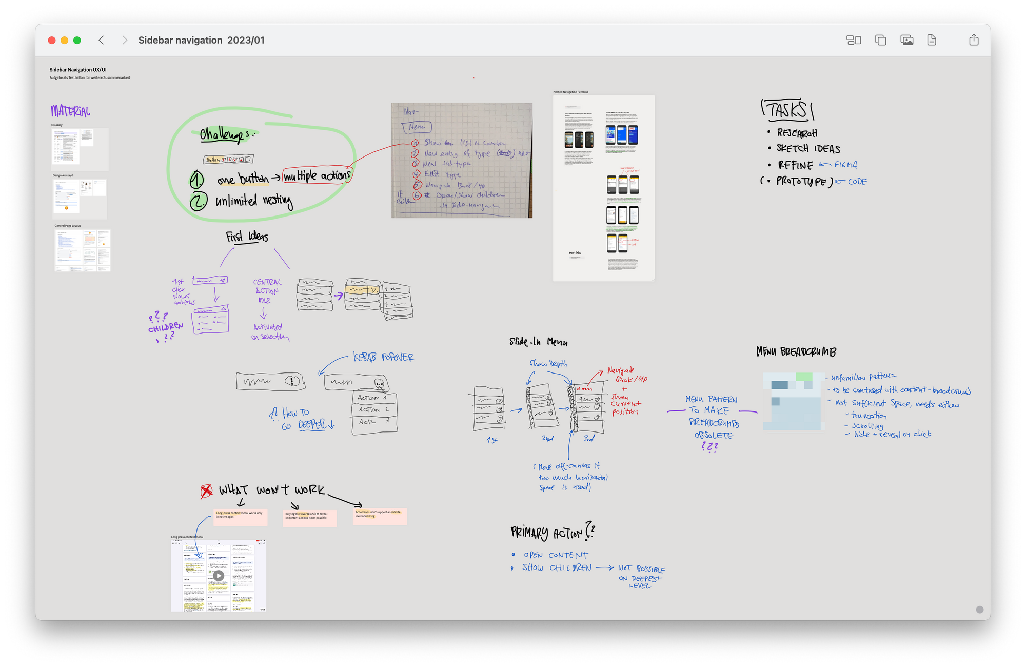
Muse offers an infinite canvas with nested boards and the ability to place images, documents, links, text and doodles freely side by side and draw all over the place. That might not sound too exciting, but boy, I totally underestimated how useful and liberating it would be to have such a free-form visual workplace.
It’s worth noting just how fast and intuitive everything works, especially on the iPad. Smooth, natural multitouch gestures, no delay and real-time sync make it so, so enjoyable to work with.
MyMind: Saving inspiration, and more

Let’s eat that frog first: Mymind is rather expensive. And worse, there is no good export and no way to pause your subscription. Once you stop paying, you lose almost everything you did with it. “Almost” because you can download a CSV file along with all files stored inside, but I haven’t found a way to make any use of that.
I think being fully aware of such shortcomings makes it easier to commit to it than finding out later.
I’m using mymind to capture and store:
- visual inspiration, from design to art
- memes, quotes, tweets worth keeping
- products or services I’m interested in
- movies or books I consider consuming
- everything else I don’t know where to put
Simply save and retrieve
What’s most compelling is that with mymind I’m spending no time to organize stuff. All it takes is one click to save a thing, and mymind’s AI does its magic to automatically tag it and present it in an appropriate format, such as a book cover or a website screenshot. If I’d like, I can add my own tags and descriptions, which is helpful, e.g. to create impromptu mood boards for a project. But it’s not necessary.
As always, I care a lot about joy of use, and mymind’s user experience can be simply described as delightful.
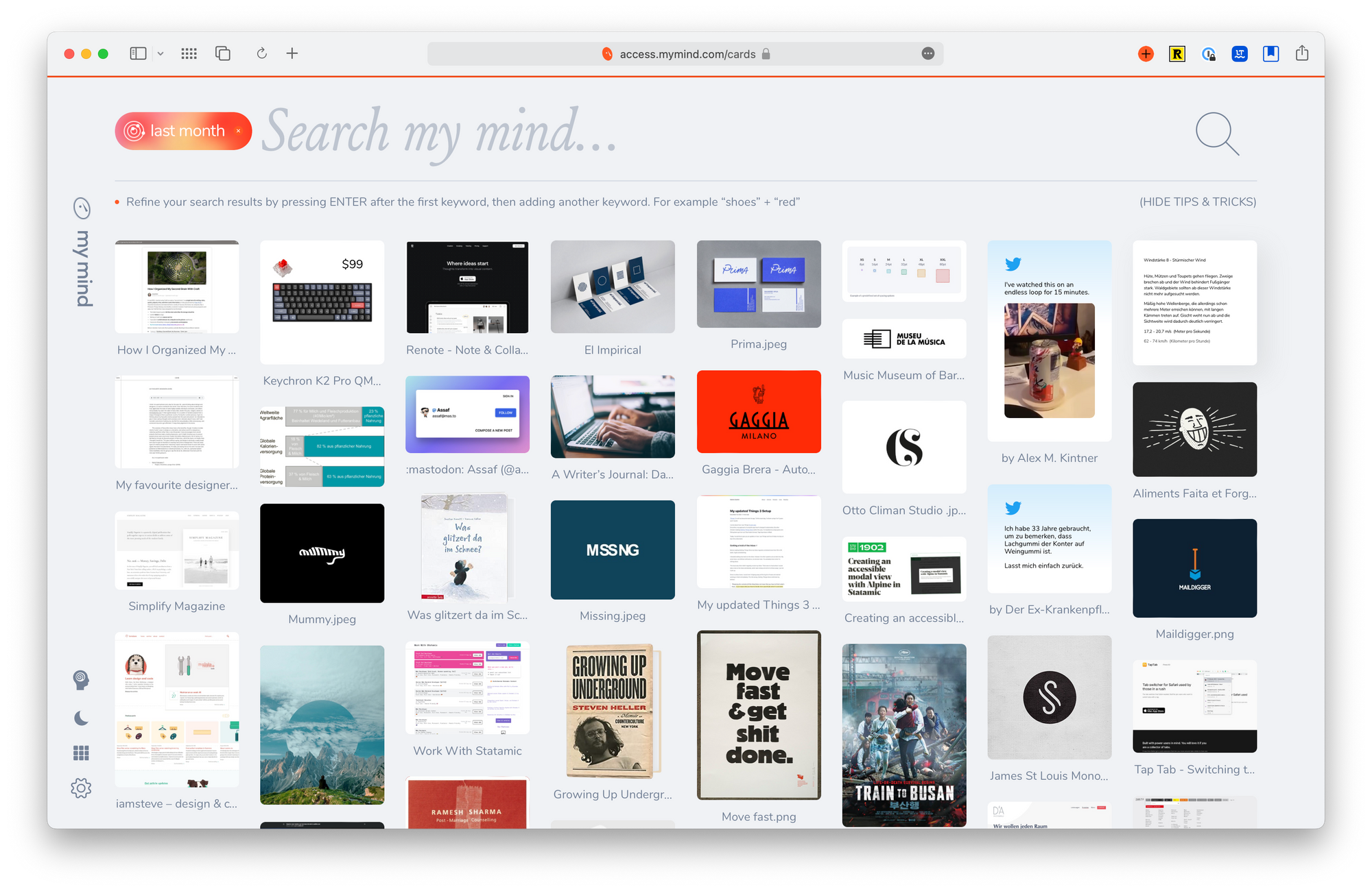
Mymind’s primary, not to say only, interface is a search bar. Type what you’re looking for and get instant results. Type more to narrow the down the results if necessary. As the AI does an impressive job of tagging traits like objects and colors for saved content, you’ll likely find better results than if you had done tedious manual categorization. There are some special keywords to find cards by their type, e.g. see all your saved notes, tweets quotes, books, colors or articles.
Mymind accepts natural language input for dates, which is super helpful when you’re doing weekly or monthly reviews: Just search for last month and see what was on your mind during the last month.
Another feature I enjoy using regularly is called “Clear my mind”. It shows you a bunch of random cards one after another and asks you Tinder-style, whether you want to keep it around. A simple but effective way to find forgotten treasures and, at the same time, clear out the weeds.
While Craft, Muse and mymind are the tools I currently enjoy working with most, there’s a bunch or more apps I’ve mostly been using for a long time, with no intention of changing that:
- Things: I always come back to the beautiful simplicity of Things to manage tasks. Usually, a task is a higher-level abstraction of something that lives in more detail inside another project management system like Notion or Jira. As a freelancer, I work across a couple of different external tools, but in Things I can see a bird’s-eye view of what’s on my plate.
- Waking Up: I like Sam Harris’ non-religious approach to meditation and find the concept of non-dualism fascinating. The app not only contains a great, ever-growing collection of guided meditations but also interesting conversations and lectures on the topic.
- Day One: I’ve grown tired of Day One in the last couple of years and spent quite some time finding a trustworthy alternative last year (Everlog came closest, but wasn’t enough yet). This year, instead of complaining, I’ll focus on journaling more, and I’m gonna focus on the features I like about Day One (which is enough to fill another blog post).
- Readwise & Readwise Reader: As an early Readwise user I’ve been on the Readwise Reader beta for quite a while. I don’t exactly love its UI, but its functionality is just too amazing to not use it. Plus they’re still in beta and working on improving stuff.
- Reeder: While Readwise Reader offers to subscribe to RSS feeds, I still prefer a beautiful native app to skim over my feeds. If I deem an article worth highlighting I’ll send it to Readwise Reader.
- Endel: Buying the lifetime early on clearly panned out well for me. I use Endel’s focus music very often to concentrate at work.
- Tyme: Tyme has been my time tracking app ever since I worked on my first freelance project. Not exactly delightful, but gets the job done without being in the way.
- Apple Notes: I’m using Apple Notes to store boring stuff that I need to keep around or things I share with my wife. As Notes does a good job of indexing PDFs and images I find this a good place. Should Craft ever get a better search, I might set up a separate space and move it over there.
- Notion: These days, I’m using Notion mostly within the workspace of an agency I work with a lot — and I still think it’s great for collaboration. However, as a solo freelancer, I just don’t need all that. I’m keeping my private space around for legacy reasons, but I don’t use it actively anymore.
I’m curious: Do you also feel some kind of app fatigue? And if so, what is the stack you’re dedicated to stick with?
