 |||
|||
Going back from all-utilities to plain CSS for styling buttons has made my life easier.
Please note: I have zero interest in taking part in that dreaded love/hate Tailwind argument that cooks up every other month on social media. These are just some reflections about how I’ve been doings thing for years, and what I consider changing.
As a part of reevaluating the use of utility CSS in various use cases, the ubiquitous button component is one of the first instances where I’ve decided to go back to vanilla CSS. It has become tedious to change things, add additional variants or add template logic.
So I’ve removed those utilities from the button component’s markup:
I’ve just moved those rules in a file called button.css , as a first step by just dumping all rules into the CSS using Tailwind’s @apply . (I’m aware that using @apply is not the best or even encouraged way, but it’s a good bridge to move quickly).
The big bonus: By writing good old CSS it becomes very simple to override a button variant based its context. This saves a lot of template logic or editor work. The cascade is, of course, as old as CSS itself, but I confess I kind of forgot about its possible usefulness.
Say this is our default styling for a primary and secondary button:
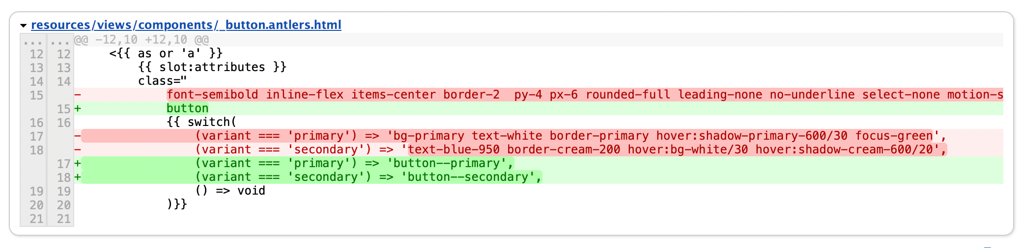
.button {
@apply font-semibold inline-flex items-center border-2 gap-2 py-4 px-6 rounded-full leading-none no-underline select-none motion-safe:transition hover:shadow-lg active:translate-y-0.5;
}
.button--primary {
@apply bg-primary text-white border-primary hover:shadow-primary-600/30 focus-green;
}
.button--secondary {
@apply text-blue-950 border-cream-200 hover:bg-white/30 hover:shadow-cream-600/20;
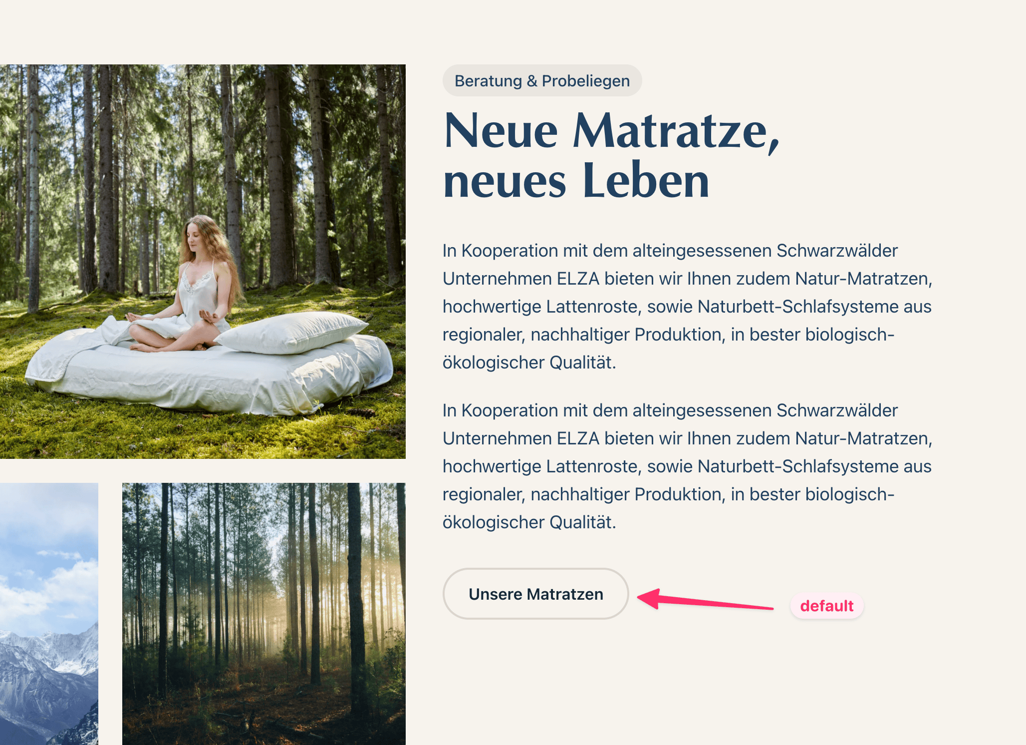
}This creates a secondary button with a transparent background, dark text and a subtle border. It work’s great on a light background:
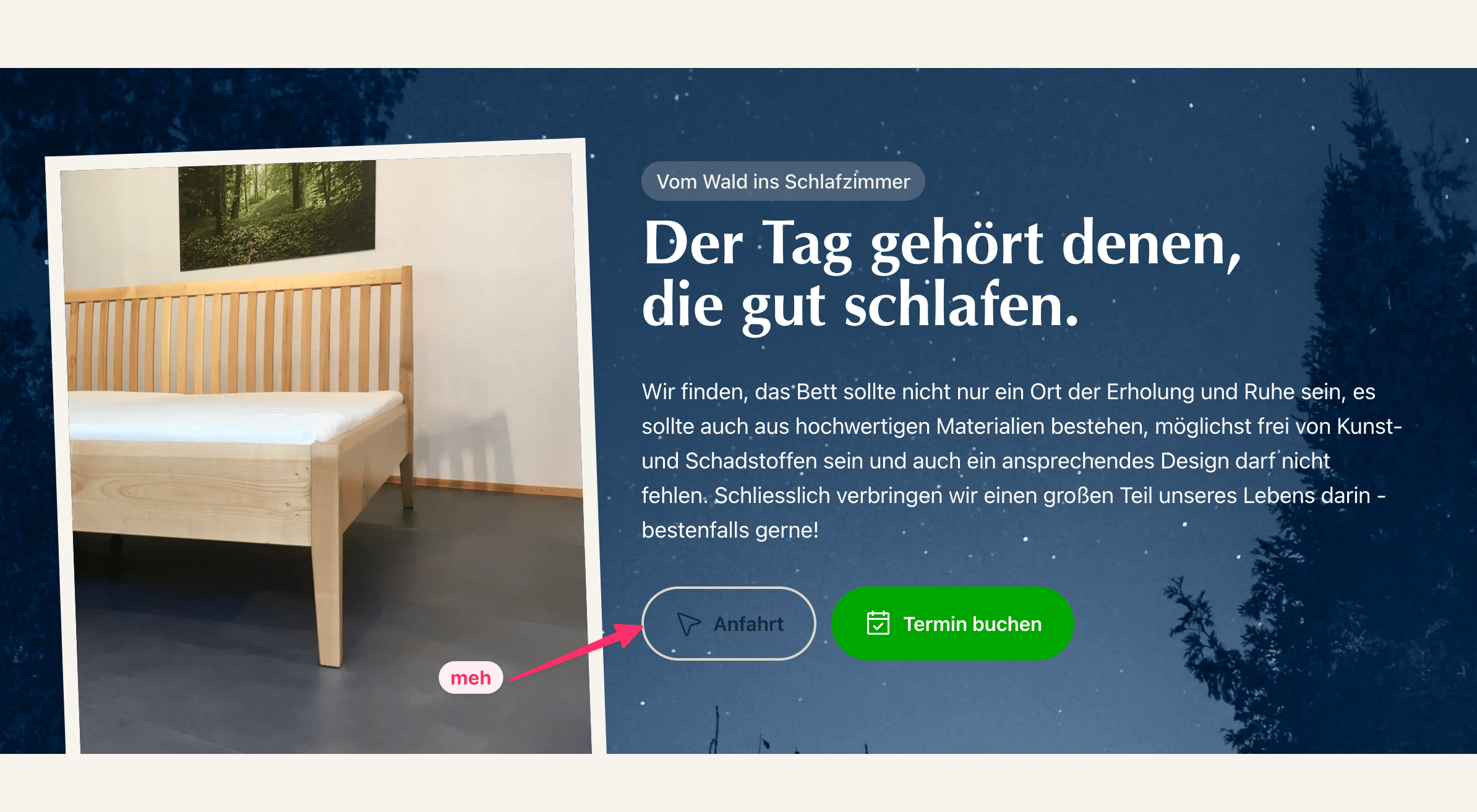
But when put on a dark background, it fails:
Now, we could create a new button variant. Then we’d write some template logic to use that new variant at the right time, such as when the button is placed inside a certain component. Or we put the burden on the editor and make them choose the correct variant in the CMS. Then they need to choose a button variant based on hierarchy and visual design. Both makes things more complicated. Let alone that we’re still talking about a secondary-level button from a UX hierarchy.
This is a perfect use case to embrace the cascade and just override the secondary button’s default styling — depending on the component it’s used within:
/* Buttons on dark background need some overrides */
[data-component="night_slide"],
[data-component="cta"] {
    .button--secondary {
        @apply bg-white border-white focus-white;
    }
}
And we’re done.
This seems almost too obvious and I’m really curious where this journey will take me 😊