Vertical vs. Horizontal Cards: Which Are Better?
UX Movement
The best way to display content
10 Sep 2023
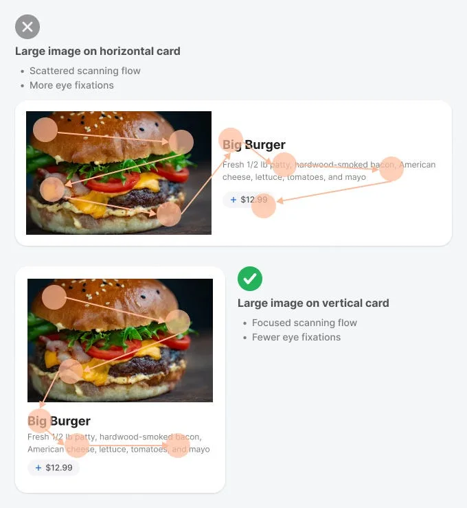
The right card choice depends on several factors. If you’re using large images to communicate information, a horizontal card produces a scattered scanning flow because it requires more eye fixations. In other words, the content takes more visual effort to consume.
The right card choice depends on several factors. If you’re using large images to communicate information, a horizontal card produces a scattered scanning flow because it requires more eye fixations. In other words, the content takes more visual effort to consume.
Conversely, a large image on a vertical card produces a more focused scanning flow
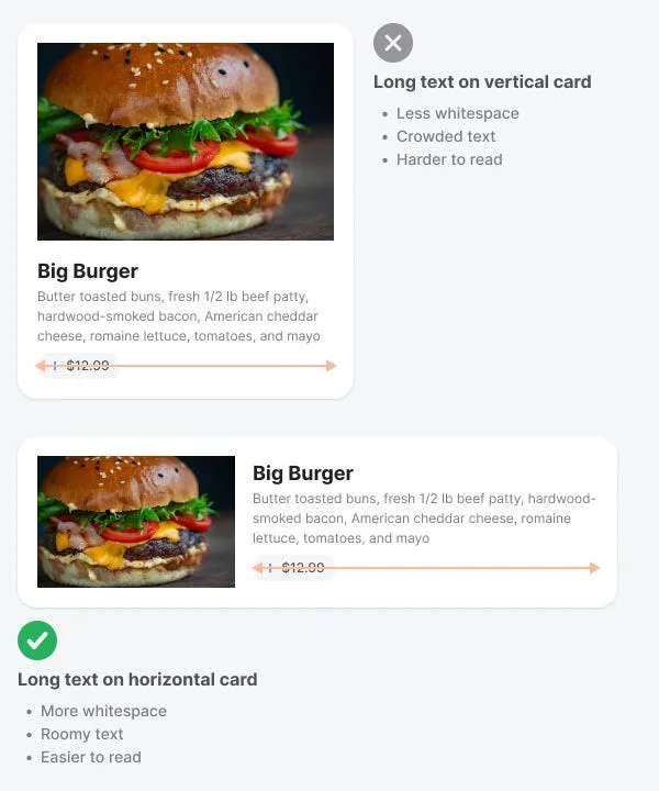
Sometimes your text will communicate more information than the images. If this is the case, horizontal cards are the better choice. You can fill them with long text without making it hard to read because users have more whitespace to read each line.
On the other hand, long text on a vertical card has less white space and looks more crowded
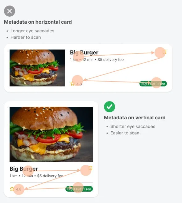
Metadata on a horizontal card is not ideal because it produces longer eye saccades. Users have to move their eyes across the card in longer sweeps. However, metadata on a vertical card produces shorter eye saccades so users can scan it quicker and easier.
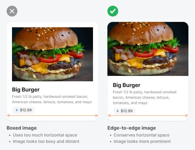
The example shows a boxed and edge-to-edge image of a hamburger with the same pixel size. When displayed edge-to-edge, the hamburger appears closer to the user, while the boxed hamburger looks further away.
The boxed image makes the hamburger look like it’s inside an artificial frame. The edge-to-edge image removes this perceived frame to make the hamburger look more natural.