Hamburger Menus and Hidden Navigation Hurt UX Metrics
Kara Pernice
Summary: Discoverability is cut almost in half by hiding a website’s main navigation. Also, task time is longer and perceived task difficulty increases.
24 Jan 2024
Discoverability is cut almost in half by hiding a website’s main navigation. Also, task time is longer and perceived task difficulty increases.
Hidden navigation is less discoverable than visible or partially visible navigation.
• When navigation is hidden, users are less likely to use navigation.
Hidden navigation provides a worse user experience than visible or partially visible navigation does, in both mobile phones and desktop user interfaces. This finding holds true across multiple UX metrics including users’ assessment of task difficulty, time spent on task, and task success.
On desktops, hiding navigation degrades the experience and the navigation discoverability more than it does on the phones.
While our qualitative user testing has repeatedly shown that navigation hidden under a drop-down menu is less discoverable on the desktop, we wanted to measure the size of this effect in a quantitative study and assess the relative impact of hidden navigation on the desktop versus mobile
Both on mobile and on desktop, people were significantly more likely to use the navigation when all or some of the navigation options were visible (that is, in the visible and combo conditions).
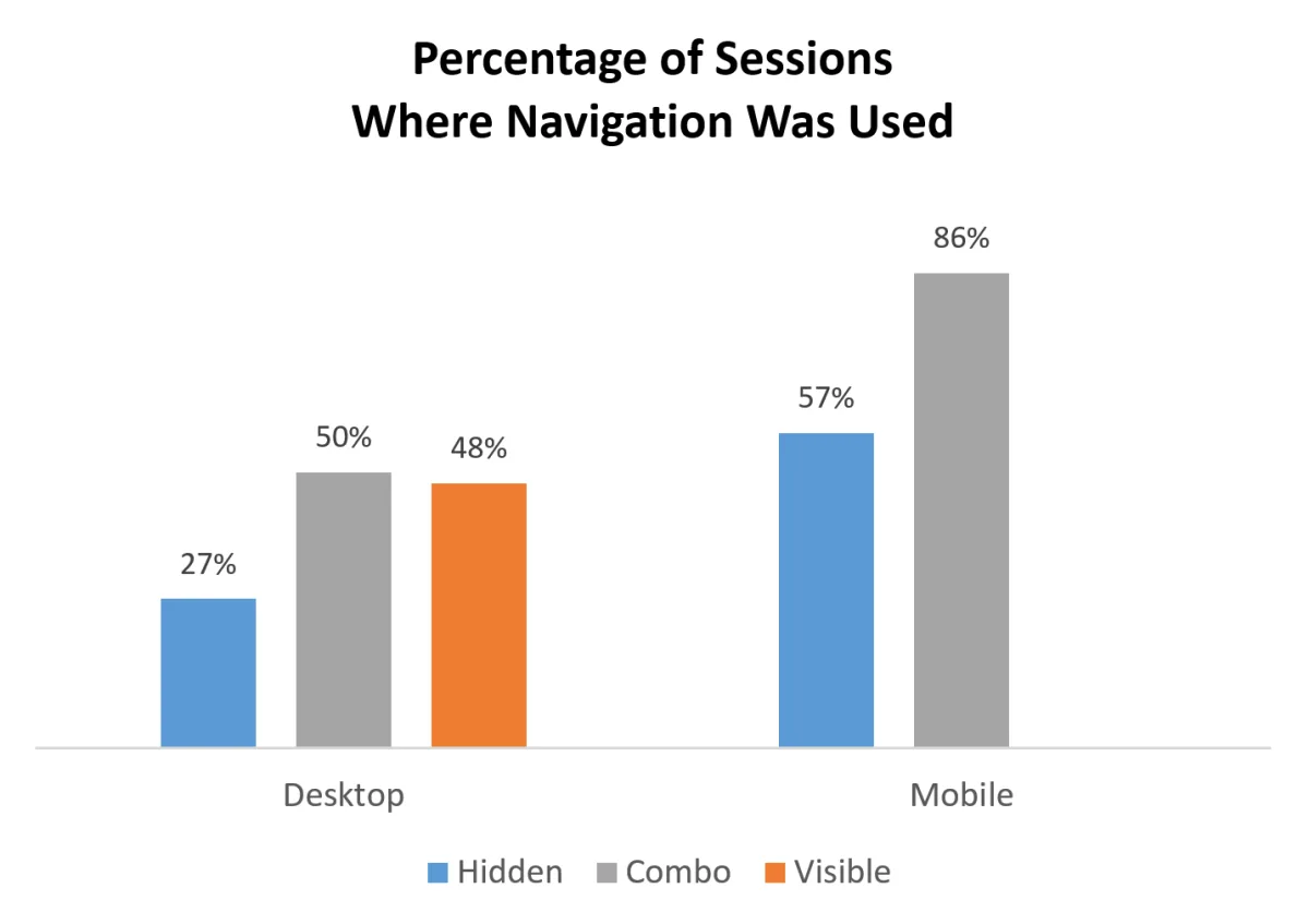
On desktop, people used the hidden menus in only 27% of the cases, while they used visible or combo navigation almost twice as much: in 48% and 50% of the cases, respectively
On mobile people used the hidden navigation in 57% of the cases, and the combo navigation in 86% of the cases — 1.5 times more.
Some test participants even said that the sites with hidden navigation didn’t have a menu.
Because hidden navigation is more common on mobile than on desktop, people may be more familiar with it and more likely to think of using it
Both on mobile and desktop, the content discoverability was significantly lower when the navigation was hidden. This measure showed a more than 20% drop in discoverability on sites with hidden navigation, compared with sites with visible or combo navigation. In other words, visible or combo navigation made people more likely to complete the task successfully and without relying on search
Hidden navigation led to significantly higher difficulty ratings than visible or combo navigation: the difficulty rating showed a 21% increase in the hidden-navigation condition compared to visible, and 11% increase when compared to combo navigation. This result is consistent with our other findings and strengthened the conclusion that hiding navigation makes it harder for users to complete their tasks. Visible navigation was ranked as least difficult, most likely because it was easy to discover and users could immediately scan the navigation options and select one of them. The other navigation types hide navigation options and increase the interaction cost
- Users took significantly longer to complete tasks on sites with hidden navigation than they did on sites with visible or combo navigation on both desktop and mobile.
• On the desktop, people were at least 39% slower when the navigation was hidden (compared with the visible or combo conditions)
Hidden navigation is more likely to reduce content discoverability on desktop than on mobile. In other words, when users had to discover content that required the use of navigation, they were more likely to fail on the desktop than on mobile. Moreover, the drop in success was greater when the navigation was hidden
• Low salience: A small icon is harder to notice on a large screen size (and even on a smaller mobile one). • Low information scent: The menu icon or label doesn’t usually tell people what’s inside it, so they have no idea if they’ll find what they need by clicking on it. • Extra work: To figure out what’s inside the menu, people must expand it. That increases the interaction cost for users and makes them less likely to do it, or, if they do it, they may take longer. • Lack of standards: Hidden navigation is implemented in different ways by different sites. Some sites use it, some don’t. On mobile, patterns are starting to form, but on desktop there is a lot of variability and inconsistency in the placement and the labeling of hidden navigation. • Low familiarity: Especially on desktops, hiding navigation is not a common pattern and people may not expect to find global navigation under an expandable menu. Some people may also still be unfamiliar with the hamburger icon that is frequently used for such menus. This low familiarity is exacerbated by the lack of standards which reduce long-term learnability
Desktop: There is plenty of screen real estate for displaying navigation options, and we recommend:
• Do not use hidden navigation (such as hamburger icons) in desktop user interfaces. • Instead display the top-level navigation options, usually across the top of the page or down the left side.