Form Field Usability: Avoid Extensive Multicolumn Layouts
Baymard Institute
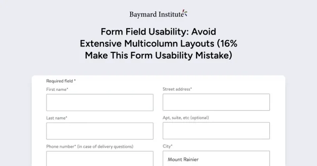
Multicolumn form layouts can confuse users and lead to errors in completing online forms. Single-column layouts help users focus and complete forms more easily. Using single-column forms is recommended for better user experience and reducing checkout abandonment.
8 Apr 2024
Notably, separate fields that are highly associated or can be thought of as a single coherent entity — such as dates (e.g., day/month/year fields); first, middle, and last name; city/state/ZIP or postal code; and credit card details (e.g., card number/expiration date/security code) — can be placed on a single line within a form.
Across multiple rounds of checkout studies, having 2–3 inputs on a single line didn’t cause issues when they logically belonged to the same single entity — and so long as the rest of the overall form layout only consisted of a single column.
In short, there is a distinction between “some lines having 2–3 fields per line” (an acceptable practice in certain cases) and an overall “two-column form layout” (generally problematic and never recommended).