Design More Engaging Landing Pages
Erik D. Kennedy
One of the most common reader submitted questions I get is: how can I make my landing page look NOT BORING?
29 Mar 2023
"Explosion" Layouts
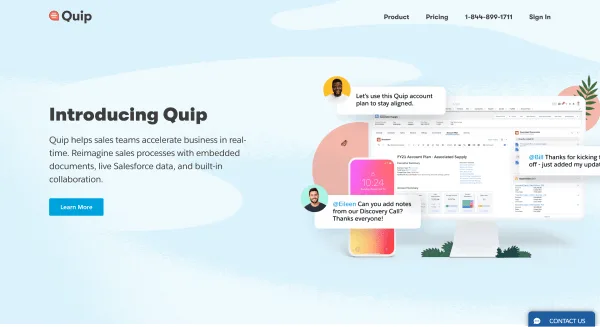
Too many landing pages simply slap on a screenshot of the product’s UI .
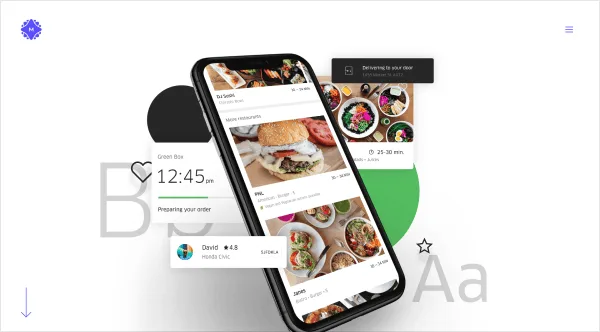
But if you chop up the UI into little bits and pieces, you can lay them out in a tasteful explosion 😎
For instance, here’s MetaLab’s project case study for redesigning Uber Eats – a pleasant scattering of design elements:
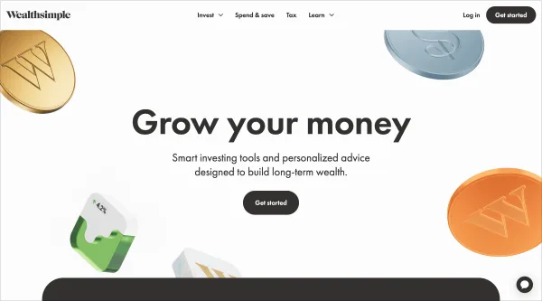
Wealthsimple uses some random coins as a motif throughout the page 👇
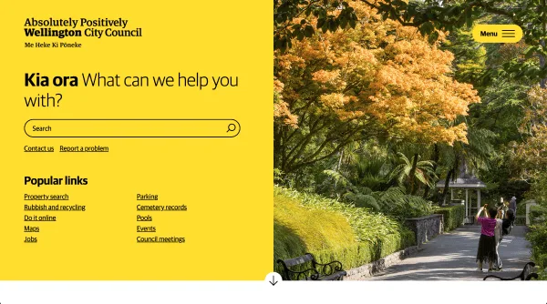
"Half-and-Half" Layouts
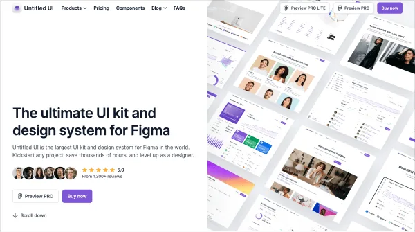
By splitting the screen in half, you can easily create a much more dramatic effect. I still think this one is underused .
Love the perspective view of the mockups here ☝️
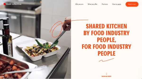
But consider that even a simple photo layout can be spiced up with this technique 👇
"Sweeping" Layouts
Next tip: consider the screen like a canvas, and ask how you might paint something dramatic . One answer: a big, sweeping swath of color .
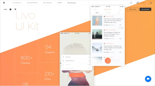
You could do this with a simple skewed rectangle (with subtle gradient ):
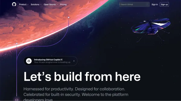
Or include it as part of an illustration or photo:
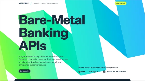
Or even make up some geometric nonsense? Whatever, as long as it (a) looks cool and (b) fits the overall vibe you need 😎
(Note that each of these use some really large text . Again, that’s part of treating the screen like a canvas. Even your type becomes a visual element more than just a text element ☝️)