Bottom Navigation Pattern on Mobile Web Pages: A Better Alternative?
Smashing Magazine
As our phones are getting bigger, we need to adjust how we build and design our websites. Is there something to learn from app design and tap bars? Can we fix the mobile navigation of our websites to have a lower interaction cost? In this article, we’ll find out.
9 Nov 2022
A more reasonable option is to keep the logo at the top of the page, but not to have it fixed. Make it a part of the content so it goes away as you scroll. That way, people will still be able to see it perfectly.
As you can see, I used the menu label in the wireframe. Kevin Robinson had found that putting a label next to the icon increased engagement by 75%:
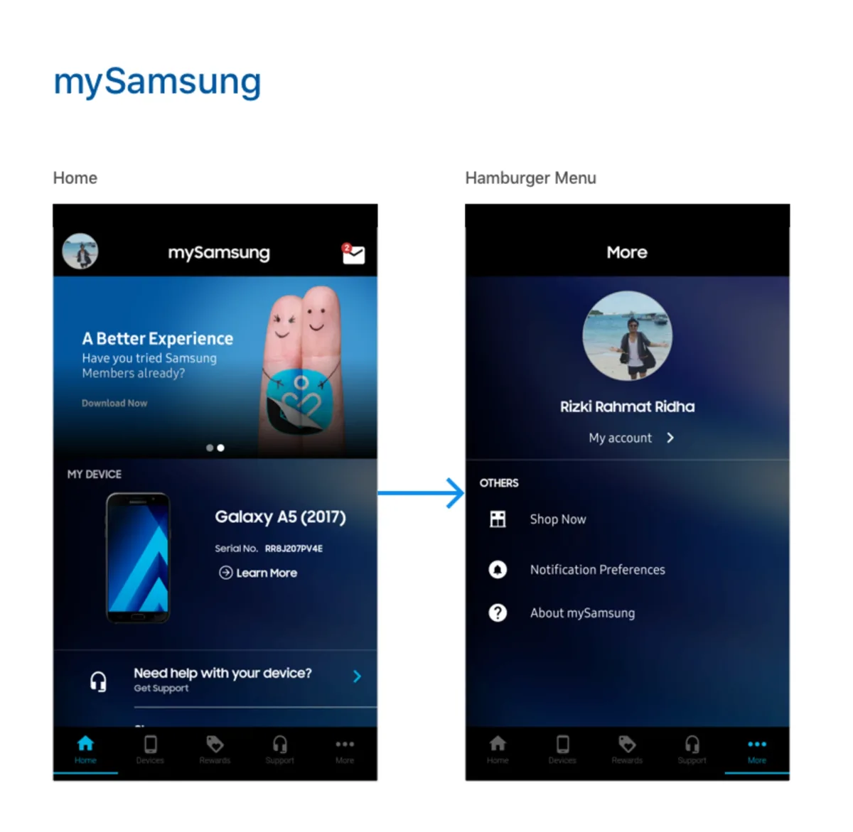
Nielsen argues that hidden navigation (hamburger menu) significantly decreases user experience both on mobile and desktop. On mobile, people used the hidden navigation in 57% of the cases, and the combo navigation in 86% of the cases, i.e. 1.5 times more! The combo navigation that Nielsen refers to is a tab bar pattern combined with a hamburger menu — here’s an example: